Input widget
The input widget displays a text input field.
Example
Properties
|
Property |
Description |
Data type |
|---|---|---|
|
|
Supported action type is |
enum |
|
|
ARIA label, which provides additional information about the element's purpose and functionality to assistive technologies, such as screen readers. If this is not provided, assistive technologies use |
string |
|
|
JSON |
string (JSON) |
|
|
Name of event that fires when a user makes any input change. |
string |
|
|
Tooltip displayed below the input. |
string |
|
|
Unique identifier of this widget. |
string |
|
|
Optional label text displayed for Input control. |
string |
|
|
Implements a Material Design outlined text field, where the label is superimposed over the border, as described and shown in https://m3.material.io/components/text-fields/overview. |
Boolean |
|
|
Text displayed as input placeholder. |
string |
|
|
Indicates whether the engine sets focus to this widget. Default is If set to |
Boolean |
type
|
Rich-media type, which is always Input. |
string |
Validation properties for input
|
Property |
Description |
Data type |
|---|---|---|
|
|
Maximum length of input, in pixels. |
integer |
|
|
Minimum length of input, in pixels. |
integer |
|
|
Pattern that user input must match. |
string (regular expression) |
|
|
Indicates whether user input is required. |
Boolean |
Context properties
These are the context properties.
|
Property |
Description |
Data type |
|---|---|---|
|
|
Label color, as a hex color code. |
string (hex color code) |
|
|
Label alignment: |
enum |
textSize
|
Label size, in pixels. | integer |
|
|
Label style: |
enum |
controlContext properties
These are the controlContext properties.
|
controlContext property |
Description |
Data type |
|---|---|---|
|
|
Input border color, as a hex color code. |
string (hex color code) |
|
|
Input border radius, in pixels. |
integer |
|
|
Input border width, in pixels. |
integer |
|
|
Input left margin, in pixels. |
integer |
|
|
Input right margin, in pixels. |
integer |
Widget-specific expression evaluations
|
Property |
Description |
Data type |
|---|---|---|
|
|
Example: |
string |
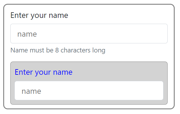
Sample form controls
 Code sample 1
var obj = {
    "widgetType": "form",
    "nodes":
    [{
            "id": "widget1",
            "controls": {
                "0": {
                    "type": "Input",
                    "label": "Enter your name",
                    "id": "input1",
                    "placeholder": "name",
                    "event": {
                        "name": "eventinputchange"
                    },
                    "validation": {
                        "required": {
                            "value": true,
                            "error": "Name is required"
                        },
                        "pattern": {
                            "value": "^[0-9]+$",
                            "error": "only number "
                        },
                        "minlength": {
                            "length": 5,
                            "error": "enter min 5 chars"
                        },
                        "maxlength": {
                            "length": 5,
                            "error": "enter max 5 chars"
                        }
                    },
                    "helpText": "Name must be 8 characters long",
                },
                "1": {
                    "type": "Input",
                    "label": "Enter your name",
                    "id": "input1",
                    "placeholder": "name",
                    "context": {
                        "itemBackground": "#D3D3D3",
                        "textAlign": "left",
                        "text": "#0000ff",
                        "itemBorder": "#808080"
                    },
                    "controlContext": {
                        "borderColor": "#ff0000",
                        "borderWidth": 2,
                        "marginLeft": 20
                    }
                }
            }
        }
    ]
}var obj = {
"widgetType": "form",
"nodes":
[{
"id": "widget1",
"controls": {
"0": {
"type": "Input",
"label": "Enter your name",
"id": "input1",
"placeholder": "name",
"material": true,
"event": {
"name": "eventinputchange"
},
"validation": {
"required": {
"value": true,
"error": "Name is required"
},
"pattern": {
"value": "^[0-9]+$",
"error": "only number "
}
},
"helpText": "Name must be 8 characters long"
}
}
}
]
}
Code sample 3
var obj = {
    "widgetType": "form",
    "nodes":
    [{
            "id": "widget1",
            "controls": {
                "0": {
                    "type": "Input",
                    "label": "Enter your birthday",
                    "dateFormat": "dd/mm/yyyy",
                    "id": "input3",
                    "placeholder": "name",
                    "material": true,
                    "actionType": "date",
                    "event": {
                        "name": "eventinputchange"
                    }
                }
            }
        }
    ]
}